Web Design for Mobile: Adding Custom Devices in Firefox
A Comprehensive Guide to Custom Devices, Resolutions, and Pixel Ratio

Hi, I'm Jhordy Gavinchu, a Software Engineer with a deep passion for Web Development especially for Frontend Technologies.
One of the key best practices in developing websites is to consider mobile devices as the primary platform, given the increased usage of smartphones for internet browsing. This tutorial focuses on adding custom devices in Firefox for testing your websites across different screen sizes. The concepts of logical resolution and pixel ratio play a crucial role in this process so we also explain a basic theory too.
Responsive Web Design Essentials
Responsive web design involves designing web pages that can adapt to different devices such as smartphones, tablets, and desktop computers. By utilizing CSS techniques like flexible layouts, fluid images, and media queries, web developers can customize the content and design based on the user's device and screen size.
Understanding Resolutions and Pixel Ratios
When purchasing a new phone, it's common to consider the display resolution before purchasing but this resolution is different from the resolution that we use for designing and developing webpages.
There are two types of resolutions in the context of display resolutions and web design, physical resolution, and logical resolution.
Physical resolution (also known as native resolution or device resolution) refers to the number of pixels on the display, representing the hardware capability. For instance, the Samsung Galaxy S23+ has a physical resolution of 1080x2340 pixels.
Logical resolution (also known as CSS resolution, viewport, or effective resolution) indicates the resolution used by the operating system or graphics driver to render on the screen. It is usually lower than the physical resolution. For the Samsung Galaxy S23+, the logical resolution is 360x780 pixels.
Calculating the logical resolution for a device involves using the pixel ratio (scale factor or density display). We can determine the logical resolution by dividing the physical resolution by the pixel ratio.
For the Samsung Galaxy S23+ with a pixel ratio of 3, the width of 1080 pixels becomes 360 pixels, and the height of 2340 pixels becomes 780 pixels. So, as you can see, the logical resolution can be calculated, only using the pixel ratio.
Finding phone resolutions and pixel ratios
While some phone and display brands may not provide the pixel ratio, I have prepared three methods to obtain this information:
Using the phone itself
Visit the website www.mydevice.io from the desired phone to view the pixel ratio, viewport, and other valuable data. Notice that the viewport term is most commonly used when referring to the logical resolution.
Searching online
Utilize search engines to find websites that list devices alongside their viewports. For instance "Samsung Galaxy S23+ viewport". I regularly use: https://yesviz.com/mobiles.php and https://viewportsizer.com/devices/
Self-calculation
In cases where you don't have access to precise device information, you can still make estimations with the display's PPI(pixels per inch) A helpful tool can be found at jhordyess.github.io/viewport-calculator simply input the device resolution and its PPI to get your calculations.
Another approach is to divide the PPI by 150, as Boris Smus recommends in his article on web.dev/high-dpi/. For instance, if you have a device with 350 PPI, this method will give you a pixel ratio of 2.3.
$${350\over150} = 2.\overline{3}$$
Browser Dev Tools Overview
Web browsers like Firefox and Chrome offer powerful developer tools that simplify the design and testing of websites. These built-in tools allow developers to inspect and manipulate HTML, CSS, and JavaScript code in real-time, facilitating the optimization process. One of these features is device emulation.
To initiate device emulation in Firefox:
Open the webpage you want to test.
Press
F12to open the dev tools panel.Click the "Responsive Design Mode" button.

Now we have access to other useful features for responsive design, for example: device selector, internet throttling, or taking screenshots.
Adding Custom Devices in Firefox
Firefox's developer tools provide a method for adding custom devices to emulate specific mobile phones. By following these steps:
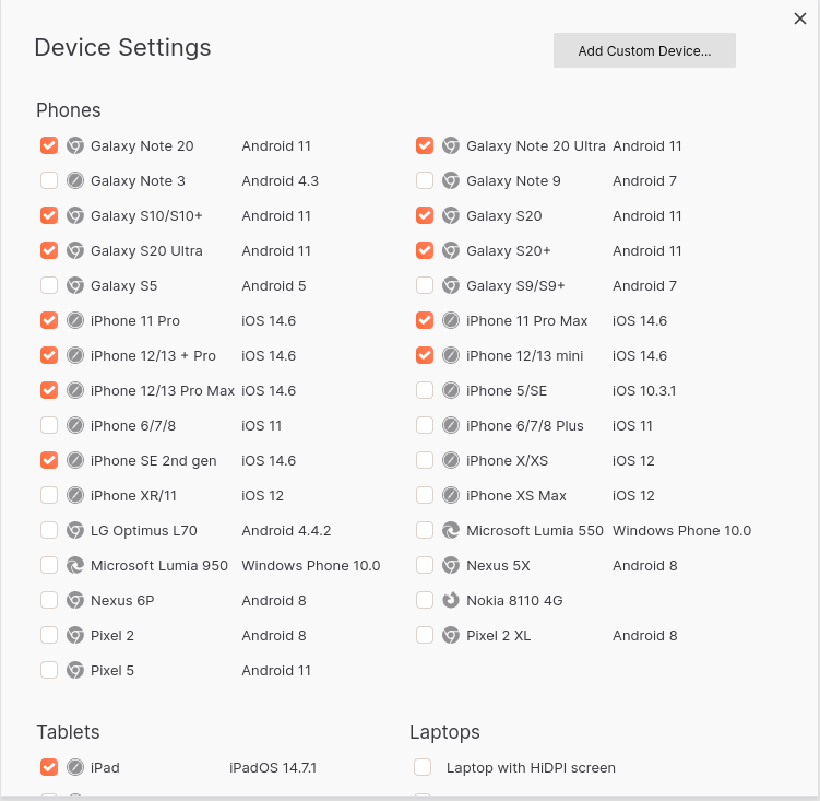
From the previous steps, click the device selector button, followed by the "Edit list" option at the end of the drop-down menu, and a new panel called "Device Settings" will open.

From here, you can add custom devices by clicking the "Add Custom Device" button. Input the relevant data, such as the device name, size, or pixel ratio. Here is an example for Samsung A30 based on: https://yesviz.com/devices/samsung-a30/
 ☝An empty user agent string might suffice for design purposes, but in certain situations, it could become a necessity 🤔.
Finally, saving the new device will allow you to select it from the device selector.
Furthermore, you can choose whether to display or conceal default devices, and you also can modify or remove custom devices to suit your specific needs within the "Device Settings" section.
Outro
In this tutorial, we covered how to add custom devices in Firefox and explored the concepts of physical and logical resolutions, as well as pixel ratios.
By using the browser's dedicated developer tools, web designers can effectively test and optimize their websites for an optimal user experience across various screen sizes.


